
INTRODUCTION
Brand identity, website design, & print design for The Lotus Herd, a non-profit horse rescue based in Canby, Oregon that provides equine therapy & animal experiences for people in need of healing.
PROJECT TYPE
BRAND IDENTITY
WEBSITE DESIGN
PRINT DESIGN
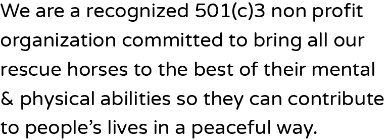
The Lotus Herd is a recognized 501(c)3 non profit organization committed to bringing their rescue horses to the best of their mental & physical abilities so they can contribute to people’s lives in a peaceful way.
This brand identity features an approachable design ethos with a lush color story symbolizes health, harmony, & balance, echoing the brand's commitment to holistic well-being.
PRIMARY TYPOGRAPHY

LARGE & MEDIUM HEADLINES

COLOR
PRIMARY

WHITE
#FFFFFF
BRANDING
PRIMARY

VIOLET
#662D84
SECONDARY

MOSS
#7D8C3C
SECONDARY FONT

SMALL HEADLINES, BODY COPY, & LINKS
ACCENT

SAND
#DDD1C5
ACCENT

BLACK
#000000
Along with the brand name, the visual identity speaks to the spiritual, & holistic nature of this non-profit. With a goal of healing and rejuvenation for both their horses & their guests, we emphasized a peaceful & energizing color palette.


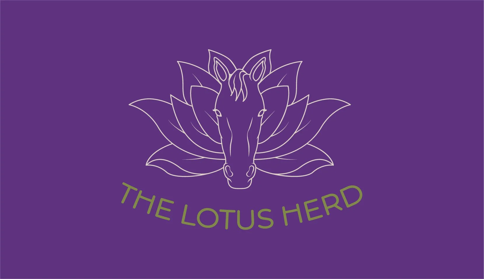
The logo features an illustration of a horse face among the petals of a lotus flower which serves as a reminder of the brand's commitment to growth, authenticity, & meaningful connection.


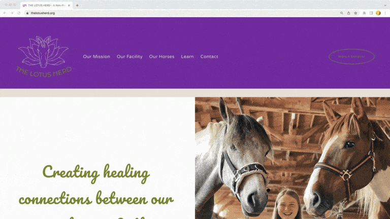
The website is multifunctional & easy to navigate. It showcases every horse on the property & gives supporters an easy way to donate to the cause.